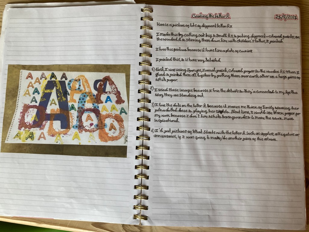
I’ve been working on food, festivities and my imaginary characters. I have researching art works relating to food such as still life and feasts and meals. Over the summer I collected letters and typography of contemporary culture. The letters and words that I have included are the from popular TV series, films, food, cartoons, brand names, stores, apps etc.

The Peasant Wedding is a 1567 painting by the Dutch and Flemish Renaissance painter Pieter Bruegel the Elder. This painting depicts people having a lot of fun and talking, there are musicians making music. There is a lot happening in the picture and the room is full of people around a table having food and more people coming in from outside. People are doing things and are busy and there is a big tray with pies. The colours red, white and green remind me of the Mexican flag.

This is a picture of The Last Supper by Leonardo da Vinci. This picture is popular because I always see them in churches & in the bible. The picture shows us about Jesus having his last meal with his friends before he is crucified.

This is a still-life of McDonald’s food. I love this picture because I love how everything is displayed like a traditional painting with dark lightning using chiaroscuro. The food is totally piled up. The burgers are stacked. I love the McDonald’s logos, especially, because I love the letter M in it & it especially looks like a zig zag line because it jumps up and down & it makes me think of something I know, such as the Loch Ness Monster, some people believe it and some people don’t, an imaginary thing. I love the colour yellow in it, perfect colour on a red background. The ivy makes it look more interesting in a natural element in contrast to the fast food.

Here is a picture of a table of comfort food such as olives, mini chickens, tangerine, white bread roll, wine & an apple pie. In this picture it presents a simple merge meal, not piled up like the burgers. This picture is different to the Mcdonalds fast food still-life because it is homemade food. Both picture with a dark background.

There are photographs by Martin Parr. I love these photographs because they are especially used for special occasions such as Halloween, birthday parties & family dinners. The photographs are very colourful. I look at these picture and feel happy. But some of the pictures have gross foods, and don’t look like the things I would eat. Some of his photographs have food with wasps or scorpions. I don’t like them on the food because they’re extremely dangerous & they can give you poison to your body. I think he’s saying that food can be good for us to give us energy, & some can be bad for us, too.
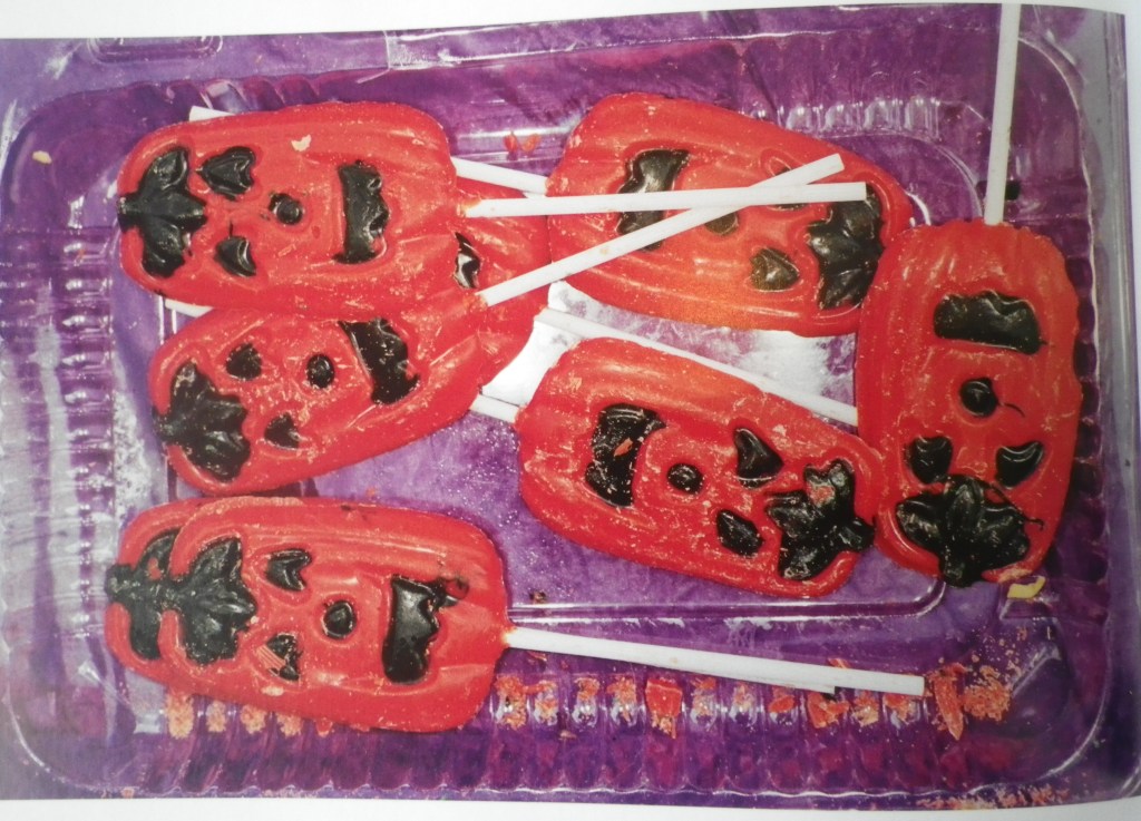

This cake has been made with food colouring.
Food is a feminist issue. Women traditionally and still prepare food. Below are three feminist artist that use text.


I don’t like the Guerrilla Girls because they look like the King Kong monster. They freak me out and can hurt me. They are a group of women wearing gorilla masks, they want to get into the art gallery. They scare me, showing their teeth and growling.
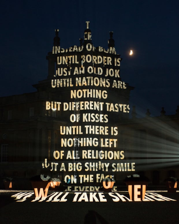
This is words and sentences on a building, I like it because it reminds me of Christmas decorations and houses with Christmas lights. The message is one of peace.

I like this picture because the clock makes me think of Big Ben, clocks show what the time is.
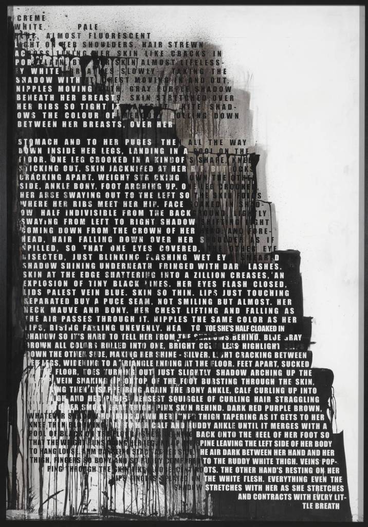

The text is dripping and suggests bleeding as the words run into each other.


This is Seren’s Mind Map showing all the things that are so important in my life. I think my favourite picture is Charlie & the Chocolate Factory: The Musical because it was really fun when I went to see it. I made this drawing by using felt tips, pencil & a black biro. I’m happy the way this picture has turned out. It is something colourful & everything around me has influenced me.

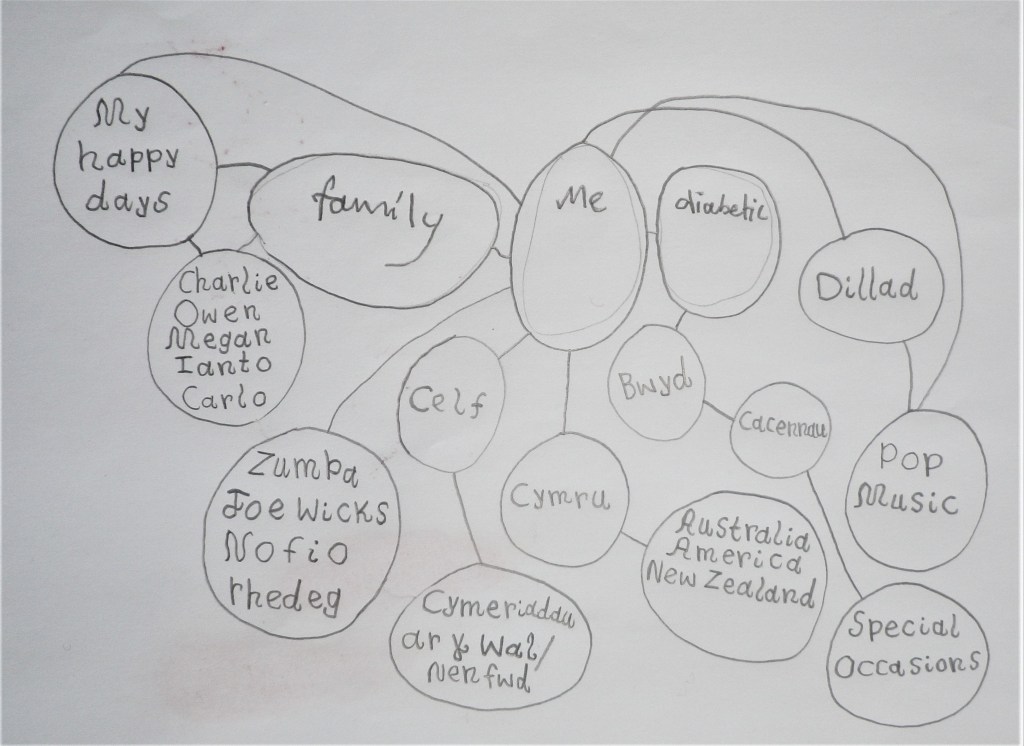
This was my example of showing what Seren’s Mind Map was going to be like just before I was about to fill the whole paper & colour it all in.


Wall Hanging by Anni Albers 1926 – Dwi’n ysgrifennu traethawd amdan y peth ‘ma. Hwn oedd fy map meddwl o ysgrifennu am yr Wall Hanging gan Anni Albers.

The Wall Hanging was made by Anni Albers in 1926, in Germany & she was at the Bauhaus. She was studying art in weaving because she wanted to study art. She was ended up in the weaving house because there was no room for her in the art shop. She was happy there. She made the images with rectangles & lines.
The Wall Hanging is stripy in vertically & horizontally & rectangles. They’re in the colours of yellow, white, black & grey. The geometrical shapes are in random pattern.
In 1926, Anni Albers first designed Wall Hanging on a piece of paper, & then it was woven and later rewoven in 1965.
Dyma fi yn gwehyddu fatha Anni Albers.
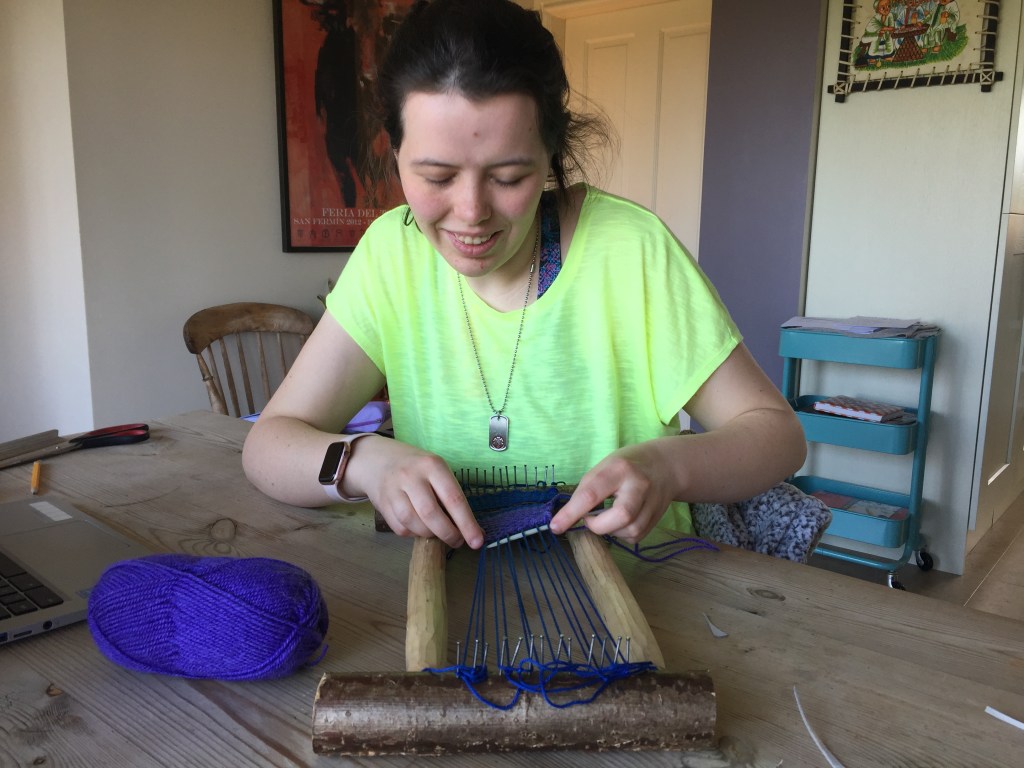

This is what I’ve been weaving. I used indigo, purple & pink wool. I was very happy when I was doing this because it almost made me think of children at a summer camp in North Carolina making this kind of textile. Anni Albers went to work in Black Mountain College there.

This painting by Piet Mondriaan showing the lines going over & under like weaving. I love this picture because I adore the bright primary colours in them. It almost makes me think of a climbing frame with squares in them.
The creation of the Wall Hanging was influenced by De Stijl (Theo Van Doesburg & Piet Mondrian) , a group of artists & architects & they have idea that things should be simple & geometrical with straight lines & primary colours, & the reason for this was to create images & structures that were harmonious & brings peace.
Anni’s artwork was different to the De Stijl work because she used colours that were light.

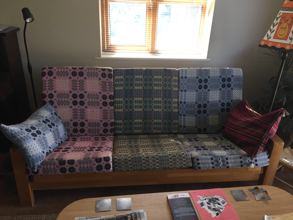
This is our sofa. The textile has been made out of wool through weaving & it has been made in Wales. There are patterns on them all (including one pillow) & I love this picture because it makes me think of something in a book or a film such as Elmer the Elephant. The colours are green, pink & blue & the patterns make me think of a shape of a waffle.

Welsh traditional woolen blankets are unique series of designs, a very old design consisting of a repeated series of pixilated squares, spikes and dots. This was produced in bright contrasting colours – greens, oranges, purples.
The blankets produced today are still produced in much the same manner as they have for over 100 years.
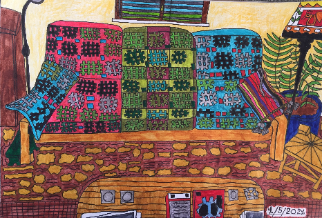
This is a drawing of the sofa that I’ve made & I love it because it looks like there would be more waffle patterns everywhere. There are even patterns on the floor of the living room, & they look like blobs & wiggly lines.

This is a Welsh Emergency Blanket & it was made by Daniel Trivedy in 2018 and won gold prize in the 2019 Eisteddfod. The blanket is made out of plastic foil which has been printed & the patterns are looking exactly like waffles, just like the blankets on our sofa. This Welsh blanket even looks like a sweet wrapper or tin foil covering. The emergency blanket is for single use & then you throw it away.

One of Grayson Perry’s The Vanity of Small Differences, a series of six large-scale tapestries. I love this picture because I love how everything is all set up on the table & how a lot of people are doing different things such as taking care of a baby. It even has lots of colours in it & patterns. It looks like a cartoon and tells a story. This looks a a bit like the drawings that I make.

This is a textile art by Sheila Hicks. I love this picture because the wools are looking like soft squishy marshmallow pillows to sit or lie down on. They’re in bright colours.

This is a sculpture piece of work by Sheila Hicks. I love this one because it looks like a chocolate fountain falling down.
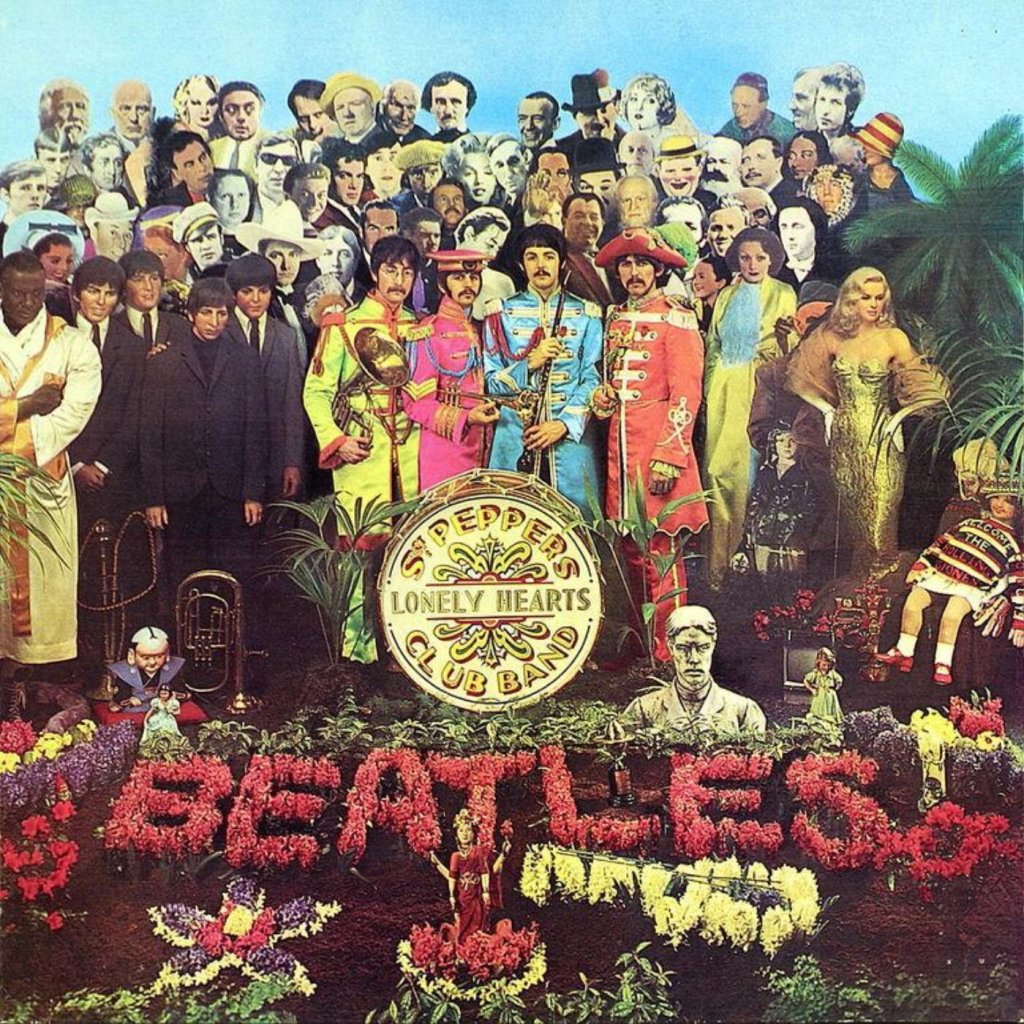
This is the Beatles’ 1967 album called Sgt Pepper’s Lonely Hearts Club Band that was made by Peter Blake. This picture has been made out of collages & I enjoy making them, too.
